We recently celebrated that Apple at long last made the decision to change its volume control in iOS 11 to something less intrusive (which, to be fair, would be almost anything but what it currently is). Coincidentally, at the same time, Redditors were having a field day over in r/ProgrammerHumor in a thread that begs the question, “Who can make the best volume slider?” The results have been pouring in since. Some are the volume slider equivalent of chindogu — not useful, but also, not useless — while others are exercises in minutiae frustration. Some are straight up absurd. They’re all delightful.
Which slider is the worst, though? Well, let the games commence.
First, the cringey slider that started it all — a classic-looking interface that simply changes the direction of functionality in a vertical volume bar. It’s a nice baseline to set, but let’s up the ante, shall we?
PM_ME_YOUR_WATERMELO/Reddit
How about this one that adjusts the volume based upon your Mac’s ambient light sensor?
ryuzaki_lost/Reddit
Or one tied to a random dice roll, because changing the volume should be exciting (and perhaps, an exercise in futility when you realize the maximum volume can only be 96).
TheSteganographer/Reddit
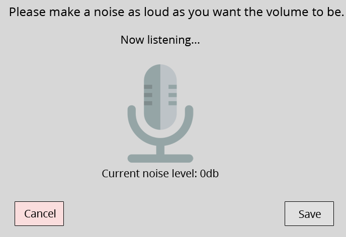
But really, volume control should be intuitive, and invite concerned neighbors to check in on you when they hear random screaming.

kittens_from_space/Reddit
Or maybe it should be uniquely yours, because we are all wonderful, inimitable individuals, and that should be celebrated.
NeverMakesMistkes/Reddit
And finally, why slide when you can launch?
BMJ/Reddit
When will user experience jokes not be funny? Probably never, as services / products continue to be in a constant race with themselves to make things “better” while often neglecting how we interact with them (ahem, HomePod). So, feel free to cry / laugh away.