In Part 7 of our 8-part History of Android series, we see how a push into new device categories, combined with an all-new design language, turned Android into the OS for everything.
Android TV, Auto, Wear, Material Design and Android apps on Chrome define the OS’s push onto even more screens, as fortunes rise and fall in the smartphone world.
When you’re dominating the smartphone world and successfully carving out a niche against Apple in the tablet space, where do you go next? In 2014, the answer for Android was everywhere. In the space of twelve months, Android exploded onto wearables, TVs (again, after the ill-fated Google TV push), cars and even Chromebooks. Android was quickly going from being Google’s mobile OS to the company’s everything OS.
In the seventh part of our Android History series, we’ll look at how Google launched Android Auto, Android TV and Android Wear to push Android into new frontiers. We’ll examine changing fortunes in the smartphone world, as Samsung stumbles and LG rises. And we’ll see how Lollipop and a new batch of Nexus devices set the stage for the third age of Android.
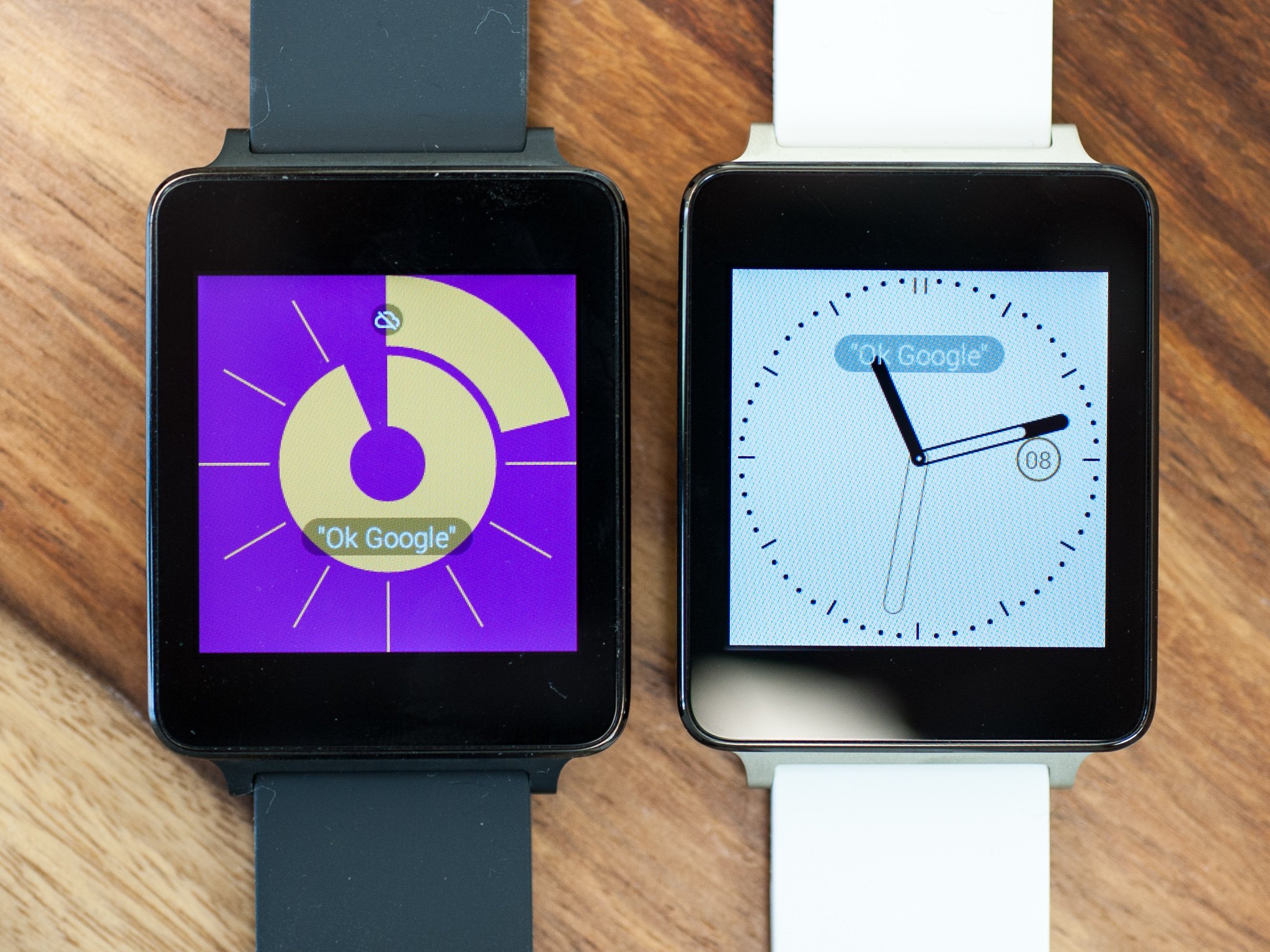
Android goes wearable
In the year before we actually got an official Google-sanctioned Android wearable, the idea of Google making a smartwatch wasn’t just possible or likely, it was kind of obvious. Although the unannounced Apple Watch was still more than a year away from being available, Samsung had managed to ship the first mass-market Android watch, the Galaxy Gear in the fall of 2013. And others like Pebble had already proved the potential of the concept.
Given Google’s track record with Android on phones and tablets, many industry watchers expected the company to adopt a similar strategy for wearables. Maybe you’d have a Nexus watch to kick things off, then manufacturers would be free to go wild with their own ideas. Diversity (or if you prefer, fragmentation) would ensue, and market share would soar.
When Android Wear eventually arrived, though, the reality was much different. In essence, every watch was a Nexus watch, and it was clear that Google intended to control the user experience and software of these wearables much more closely than it had phones or tablets.
Every watch was a Nexus watch. And everyone had to play by Google’s rules.
Similarly, Android Wear itself was never open-sourced, with Google contending that it was already built on AOSP, the Android Open Source Project.
There were a few good reasons for this more closed approach. Firstly, Android Wear relied heavily on the (very closed-source) Google Play Services on both the watch and the phone. And in being less open, Google would prevent a sea of cheap, unsupported soon-to-be-abandoned wearables from hitting various markets.
Smartwatch makers were free to differentiate through design and pre-loaded apps, of course, but otherwise they had to play by Google’s rules — much more so than in the smartphone world.
With the announcement of Android Wear itself came hardware from LG (with the G Watch) and Motorola (with the Moto 360). Motorola was already in the process of reinventing itself as “a Google company,” and the beautiful round watch that it announced was the big story on the day. By contrast, LG’s effort seemed like a reference product, oddly devoid of any real design or flair. (The same could be said for Samsung’s later Android Wear effort, the Gear Live, which shipped alongside the G Watch.)
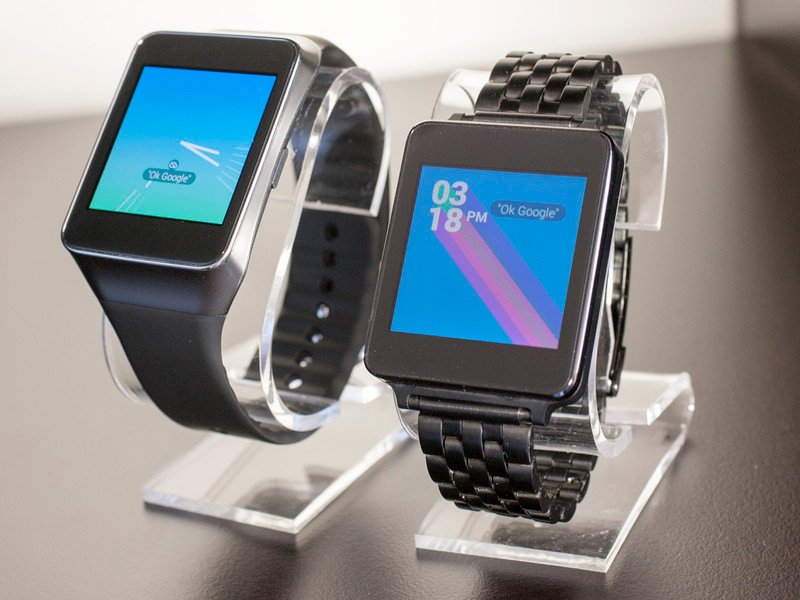
“Android Wear did not originally have a round UI.”
But the Moto 360 and its round display didn’t just happen. In fact, in the time before its announcement, Android Wear was very much a square-only platform. Motorola’s Senior Vice President of Consumer Experience Design, Jim Wicks, told Android Central that Moto itself had to push to make its vision of a round smartwatch a reality.
“The interesting thing is, Android Wear did not originally have a round UI. It was rectangular,” Wicks says, “When [Google] saw what we were doing in ’round,’ and the way we were driving things there, it prompted them to go and do ’round’ and incorporate a round version of Android Wear.”
“In fact, the UI work for the Moto 360 was a collaboration.”
“In fact, the UI work for the very first one was a collaboration. Our designers were engaged in designing that first round UI for Android because it was the way for us to get it to market in time. And in the end result it all becomes Android Wear.”
That extra UI work contributed to the long lead time up to the Moto 360’s release, as AC learned from insiders around that time. As one device maker quipped to a group of journalists at the time, “making a round screen isn’t that hard.” It was the software that everyone was waiting on.
In the following year, round designs have dominated Android Wear, with only ASUS sticking with a more traditional square UI through its ZenWatch series.
The software and UI was only half the battle, though. The first version of Android Wear, Android 4.4W, relied heavily on voice controls, lacked quick access to an app drawer and had relatively limited support for running apps on the watch itself. Instead it was all about glanceable notifications and interacting with your phone’s apps from a distance. In essence, the opposite approach to what Samsung was doing on the Galaxy Gear.
At the time of writing we’re still figuring out what a wrist-based computer should do and how it should behave. Only now are the Samsung and Google software strategies slowly approaching some common ground.
Interview: Motorola Design Chief Jim Wicks
Since Jim Wicks joined Motorola back in 2001, the mobile industry has changed beyond all recognition.
Smartphones now dominate the landscape, which has been transformed by the arrival of the iPhone and the rapid growth of the Android ecosystem. And Motorola itself has changed with it, shifting from a featurephone focus with the original RAZR devices through to the Droids and Moto phones of today. We caught up with Wicks, now SVP of Consumer Experience Design, to discuss Moto’s history with Android, and where it’s all going.
More: Jim Wicks Interview
Android Auto
“In many ways our cars keep us connected to the physical worlds around us, but they remain disconnected from our other devices in our digital lives.”
That was from Google’s Patrick Brady in announcing Android Auto at the Google I/O developer conference in mid-2014. And in a lot of ways it couldn’t be more true. Aside from basic Bluetooth connections and a smattering of proprietary manufacturer systems, there had been very little for smartphone users to enjoy in the car.
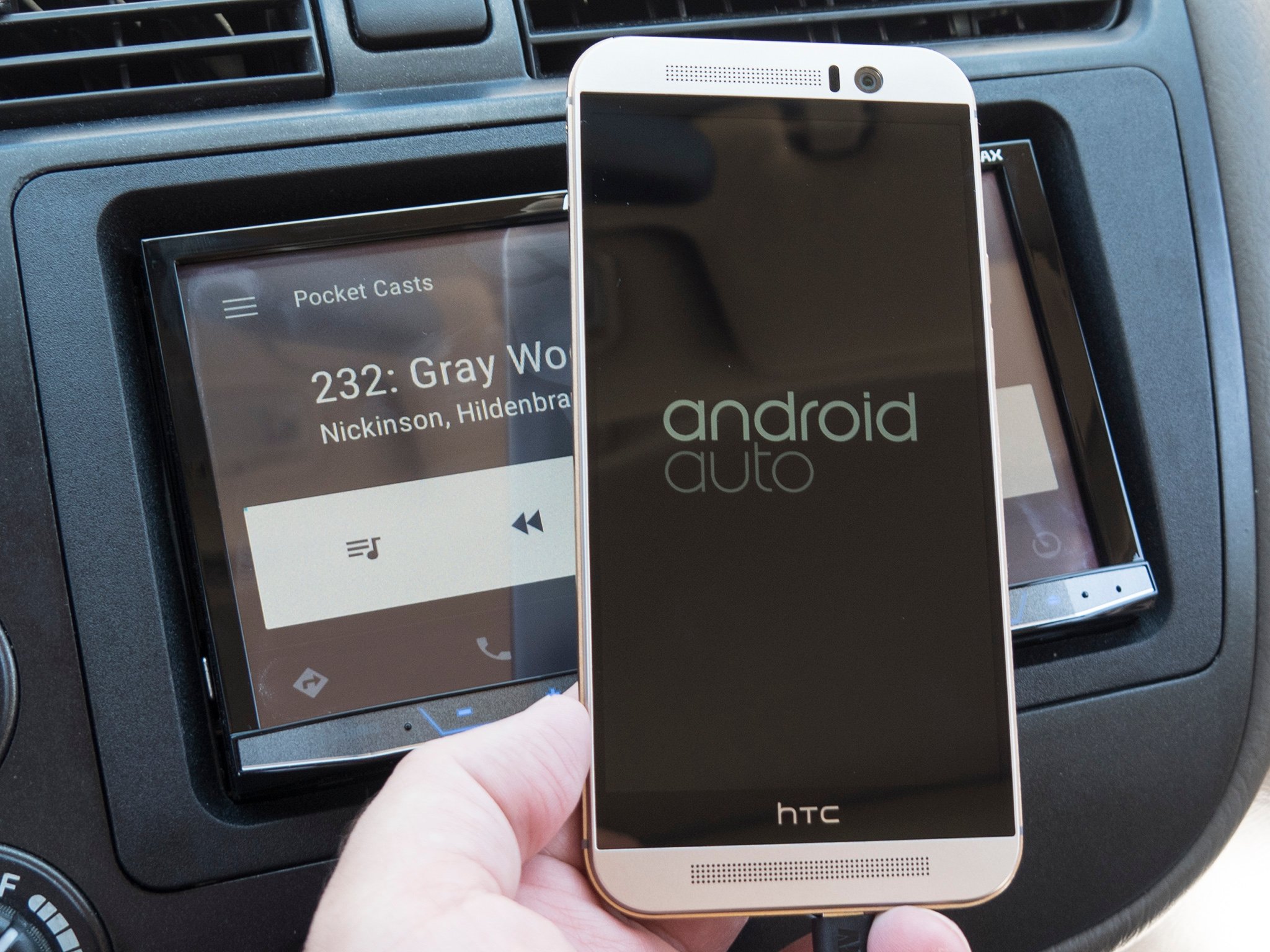
That began to change with Android Auto, and on Apple’s side of things with CarPlay for iOS.
The gist is simple: Your phone plugs into your car’s infotainment system. Android Auto itself actually resides on your handset, with the output sent to the car’s display. It’s commonly referred to as “casting,” not unlike (but also not entirely similar) to what’s going on with Google’s Chromecast. The important part is that the vast majority of the work is being done on the phone, not by the car. And that means that when there are updates to be had, they’ll be done on the phone, and not on the vehicle side of things.
The important part is that the vast majority of the work is being done on the phone, not by the car. And that means that when there are updates to be had, they’ll be done on the phone.
It’s sort of a way to bypass what traditionally (and frustratingly) has been a very slow feature to evolve. Only in the past few years have we begun to see displays with any decent resolution in the car. You might go through five or 10 (or more) phones in the lifetime of your vehicle. And those phones are subject to Moore’s Law, which essentially states that there’s no way in hell the automobile industry will ever be able to keep up with the smartphone industry. And perhaps it shouldn’t. But that doesn’t mean we don’t want our phones to play nicely with our cars.
And so we now have Android Auto. The first cars with Android Auto built in started to roll out in 2015, most notably with the Hyundai Sonata. (Though early builds of the car required a software update.) Other manufacturers followed in short suit, and many new cars support Android Auto and CarPlay, along with whatever proprietary infotainment system comes standard. Android Auto doesn’t replace the car manufacturers’ systems. (At least not yet.) It builds on it.
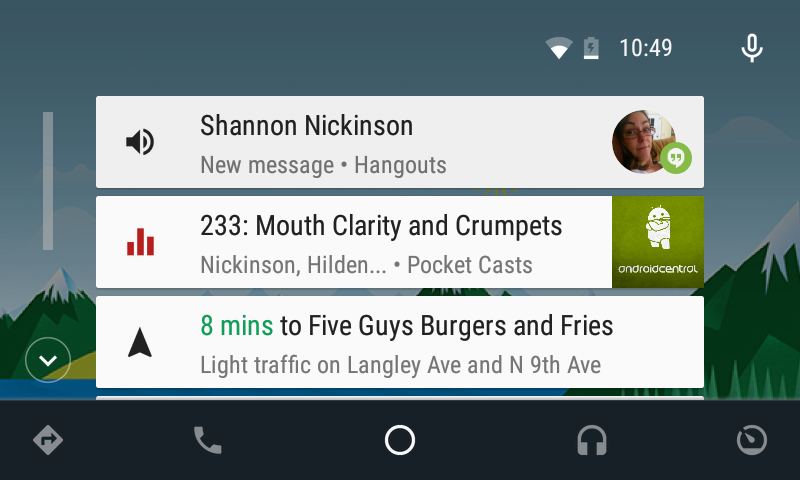
What you can actually do with Android Auto is limited by design. And that’s mostly a good thing.
There also are a few aftermarket options, including three from Pioneer, and a couple from Kenwood. We’re still expecting more companies to jump in that ring at some point.
As for what you can actually do with Android Auto, well, it’s limited. On purpose. Media apps can mostly do their thing — music and podcasts and the like. But not video. By design, Android Auto and compatible apps cannot be (and, in our experience, aren’t) distracting. Messaging, on the other hand, can get a little interesting, as there isn’t really way to keep an app from bugging you in the car. Google Hangouts and Messaging can read incoming messages, as can a handful of other apps. But you’ll quickly learn there’s a difference between an occasional back-and-forth, and getting caught in the ping-ping-ping-ping of a Skype conversation.
But it’s early days still for Android Auto. As we look back on the history of Android, it’s obvious that using our smartphones in the car — safely — will only increase in importance, and that Android Auto will play a big part in the future.
Getting Started with Android Auto
Android Auto is devilishly simple. You plug your phone into a compatible receiver — either the infotainment system that comes with your car, or an aftermarket head unit — with the same sort of cable you use to charge. Your phone — and the apps you already have — then push information to the large display that’s in your car. Check out our guide to the basics of Android Auto to find out what to expect.
More: The basics of Android Auto

HTC One, Take Three
After years of disjointed launches in various countries, the 2013 HTC One (M7) had emerged as a singular global flagship for the Taiwanese firm. Although the smaller One Mini and supersized One Max hadn’t been huge successes, the M7 itself was critically praised and well received by customers. It seemed like nobody in the Android world could challenge HTC on build quality and materials, and so the company went into 2014 looking to take the strengths of the HTC One to the next level.
So here was the HTC One (M8): softer metal curves, a bigger screen, a weird depth-sensing camera and a name that brought “M8” from a codename to a part of HTC’s brand. In fact, in the run up to launch the phone was referred to in branding as simply “the new HTC One.” The name printed on some early retail boxes was “HTC One.” Bringing “M8” to the forefront, it seemed, was a bit of a last-minute decision — likely to avoid confusion with last year’s model, which was itself rebranded as HTC One (M7).
Regardless, it’s not we weren’t accustomed to there being several HTC Ones. 2012 had given us an alphabet soup of One-branded handsets, a trend that’s continued to this day.
The phone itself, like its predecessor, was the kind of device that inspired awe when picked up for the first time. The curved metal was slippery in the hand, but was a joy to hold, arguably outclassing the latest iPhones of the time. The M8 felt special in a way that no HTC handset since has really managed to capture.
Peter Chou spent time carrying around wooden M8 mock-ups to ensure the in-hand feel was just right.
Then-CEO Peter Chou, we’re told, spent time carrying around wooden mock-ups of the M8 to ensure the in-hand feel was just right.
And HTC’s Sense software got a fresh coat of paint, with lighter colors, further customizability and new photo-editing tricks.
That was largely thanks to the unique depth-sensing “Duo camera” fitted to the back of the phone. It didn’t capture images on its own, but it could provide depth info for shots captured with the main camera, and these could then be used to apply artistic and 3D effects to the images. The only problem was the main rear camera, HTC’s 4-megapixel “Ultrapixel” unit, hadn’t changed much since the M7. As before, it was above average in low light, but performed miserably in some outdoor scenes.
It seemed like HTC had fumbled one of the most important parts of a smartphone — the camera — and tried to compensate with gimmickry. In the months that followed, rivals were able to emulate the M8’s depth-based tricks in software, without a second camera.

HTC mixed things up for the M8’s release, pushing to get to market ahead of Samsung’s expected Galaxy S5. The big secret, which was eventually outed by UK retailer Carphone Warehouse, was that the M8 was to go on sale immediately on the day of launch in some countries. But the certification and carrier collaboration required to make this work resulted in leaks. Lots of leaks.
HTC got its day-one retail launch, but lost control of the message through inevitable leaks.
Many fans’ first proper look at the M8 came not from a press conference, but from a kid on YouTube blasting out Soulja Boy through the phone’s BoomSound speakers. HTC got its day-one launch, but paid for it by losing control of the pre-launch message.
One the whole, the second-gen HTC One was as popular as the first, and HTC was a beneficiary of the unspectacular Samsung phone of that year, the plasticky Galaxy S5. But while the company was as strong as ever in design, it hadn’t made up much ground in its main area of weakness: imaging. And it still had to compete with the big marketing bucks of Samsung, Apple and LG.
And last but not least, the M8 had another honor to its name: the last Google Play edition handset to be sold before the series was mothballed. For connoisseurs of the stock Android experience who were unconvinced by the plasticky Nexus 5, the GPe M8 became a fan favorite.

Samsung slumps
There are arguments about when Samsung really peaked, but it’s clear that 2014 was a humbling year for the world’s largest Android phone manufacturer. After seeing unbridled success in 2013 with the Galaxy S3 and parlaying that brand recognition with the Galaxy S4 a year later, the rest of the smartphone industry was advancing while Samsung was doing more of the same.
The big boys had caught up and surpassed Samsung in many ways. And a cavalry of smaller players was pushing everyone to do better.
By the time the Galaxy S5 arrived in early 2015, other manufacturers had caught up to — and surpassed — Samsung in a variety of ways. Build quality? Others were experimenting with metal and glass as Samsung stuck to plastic. Software? Samsung phones ran the same Snapdragon 801 chips as rivals, but the software was laggy and ugly. As consumers were ready to upgrade from their Galaxy S3s, the mobile landscape had dramatically changed — HTC was building beautiful phones completely out of metal with scaled-back software, LG had its revitalized G series, Motorola was back with a fresh take on smartphone design and software, and a cavalry of small manufacturers was pushing everyone to do better.
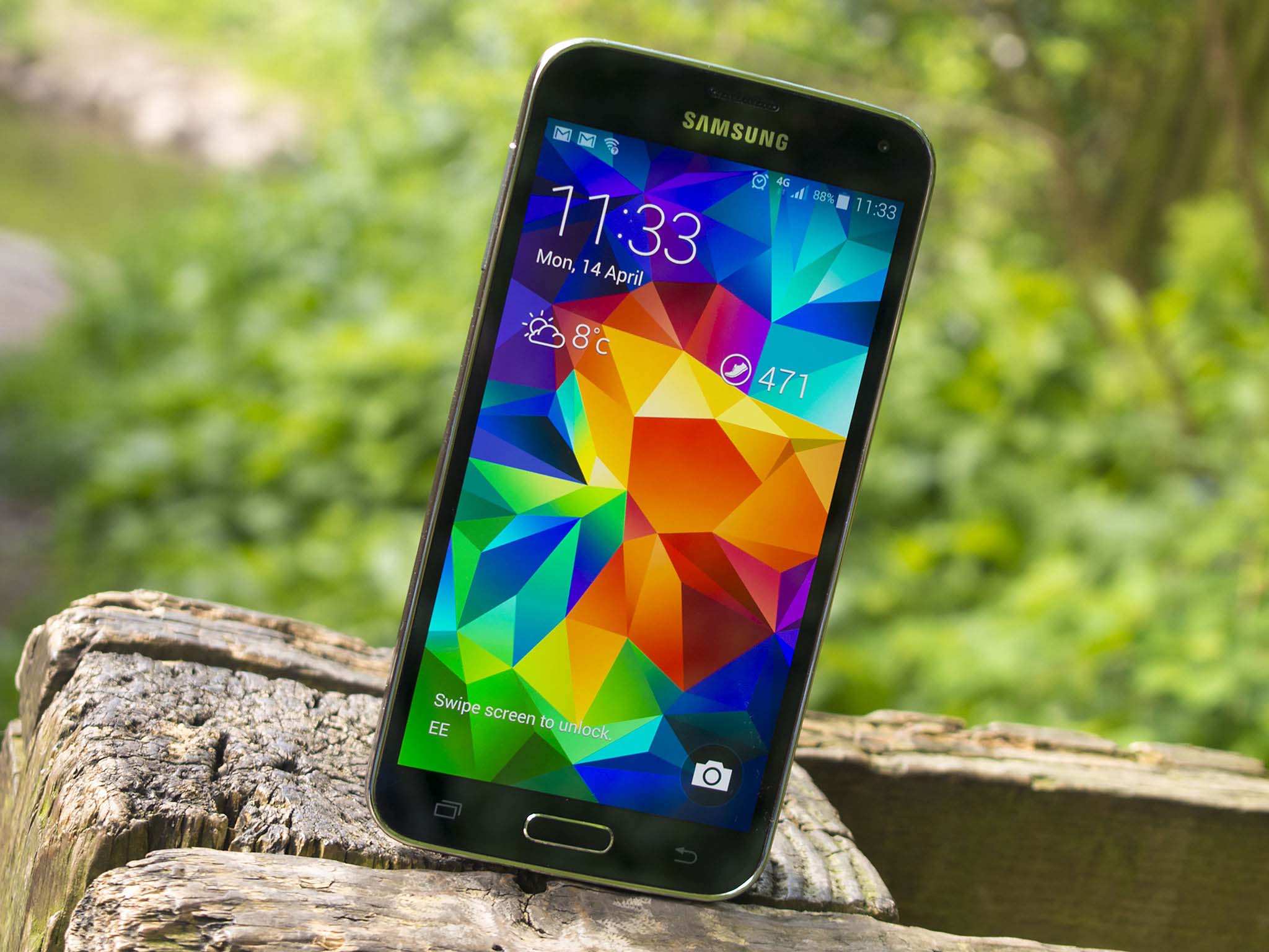
But the Galaxy S5 was basically the same as the past two iterations. It had a slightly larger screen, but was still made out of incredibly cheap looking and feeling plastic. The software still had dozens of useless features and was looking a bit dated. Camera quality was improved with a new ISOCELL sensor, but was horrid in low light and couldn’t compete with the optically-stabilized cameras from rivals. The inclusion of waterproofing was welcomed, but was hardly enough to make up for the missteps elsewhere.
Late 2014 brought about a small design revolution for Samsung, with the Galaxy Alpha and Note 4.
With increased competition and a lack of big features to get people excited about the Galaxy S5 itself, Samsung didn’t have a runaway hit on its hands in the way it did with previous Galaxy S phones. When someone was walking into a carrier store looking for a phone they no longer had the default thought of “iPhone or Galaxy” — there were lots of other compelling options that were worthy of their attention.
The realization was a cold one — the Galaxy S5 just wasn’t selling in the way that previous Galaxy S devices had, and that wasn’t something Samsung had dealt with it years. Realizing that change and improvement were needed to keep up with the rapid pace of innovation in the Android space, Samsung went with a complete re-tooling of its strategy with the releases of the Galaxy Alpha and Galaxy Note 4.
Samsung swapped out most of the plastic in these phones with finely-machined metal and tight tolerances, improved the camera experience substantially, and even started to realize that its software was overbearing and needed pruning back. It was a quick response to the criticisms of the Galaxy S5, and people noticed.
While we wouldn’t see a complete revitalization of Samsung’s phone strategy until the next year with the launch of the Galaxy S6, the Galaxy Alpha and Galaxy Note 4 were great steps in the right direction to keep ahead of the competition.

LG G3 and the Quad HD era
“Steve Jobs was wrong,” LG’s Dr. Ramchan Woo told Android Central at the G3’s London launch event in May 2014, “We love Steve Jobs, but he was wrong.”
“Steve Jobs was wrong” on smartphone pixel density, LG said.
Woo was talking about Jobs’ oft-quoted remarks at the iPhone 4 press conference, where he spoke of “a magic number right around 300 pixels per inch,” where the human retina can no longer differentiate between pixels on a screen held 10 to 12 inches away.
LG, which had itself manufactured the first “Retina” displays for Apple, had just blown right past this magic number with the G3’s astronomically high 538-pixels-per-inch Quad HD (2560×1440) panel. This was a higher resolution display than in all but the highest-end TVs, but in the palm of your hand. And there was skepticism as to whether we really needed such a stupendously dense display, and what other technological trade-offs there might be.
Like Samsung, LG now had a compelling, vertically integrated smartphone.
It turns out there were a few. The G3’s battery life was decent, but not great. And that “2K” display produced more muted colors than rival 1080p LCDs. But it was a unique selling point for LG, at a time when it was hard to differentiate against local rival Samsung. The LG G3 was also one of only a few phones at the time with optical image stabilization (OIS), which helped it outperform Samsung in night photography. And its laser-assisted autofocus, adapted from LG’s vacuum cleaner robot technology, gave it another technological first to brag about.
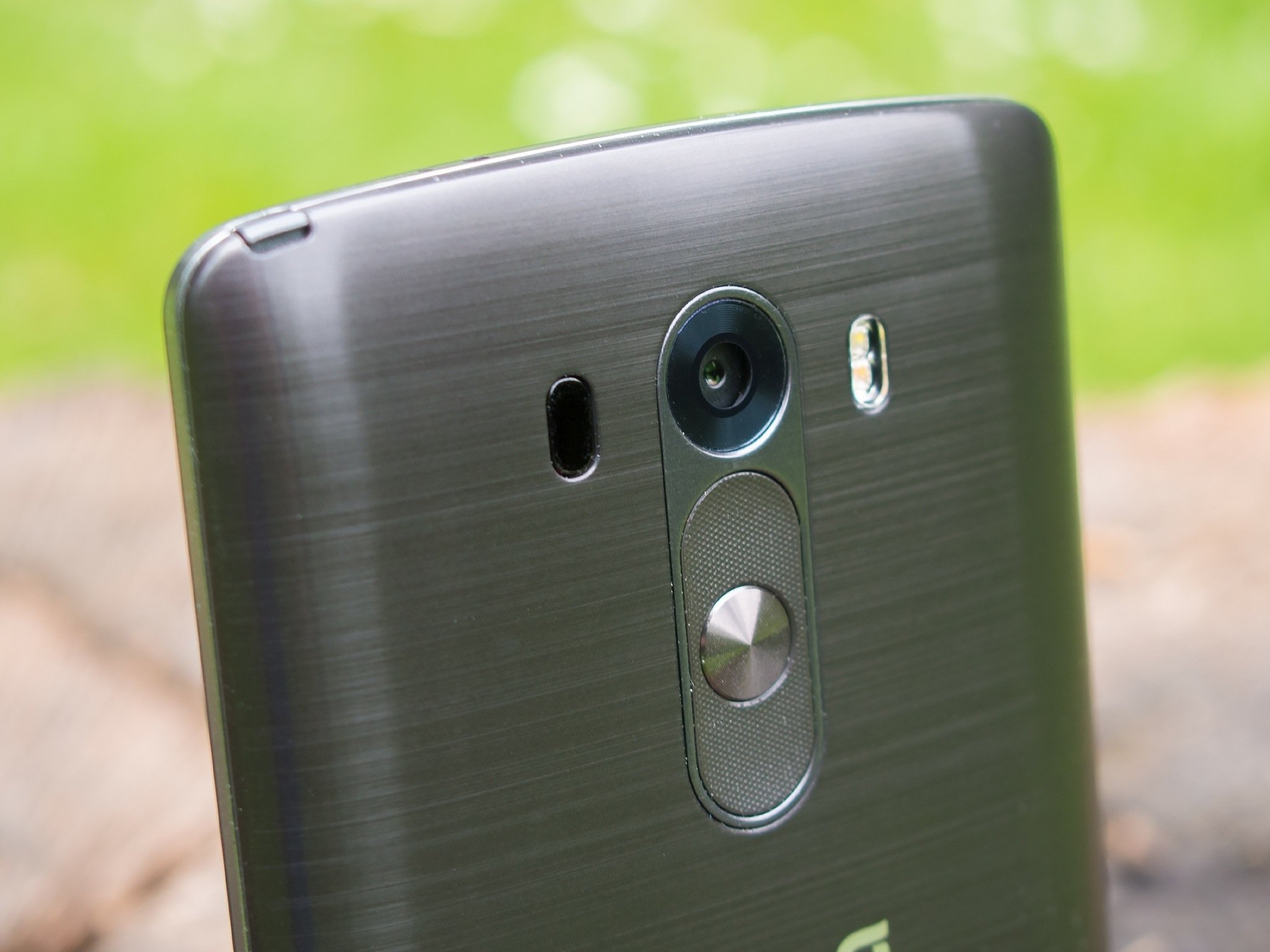
Just as Samsung was building vertically integrated Galaxy smartphones, LG was finally starting to leverage its strengths in homegrown displays, camera modules (though Sony still provided the sensors), batteries and, well, lasers. And as Samsung slumped in 2014, the G3 helped LG to a bumper year.
But some weaknesses remained. Software design and performance were pain points for LG. And while the new, geometric, pared back “LG UI 3.0” was an improvement on the technicolor mess of the G2, it was prone to intermittent lag, and often overbearing in its plastering of squares and circles over Android’s user interface.
LG’s still not top of the pile when it comes to software design. And other QHD phones would follow later in 2014, as display and chipset manufacturers got a better handle on things. Nevertheless, the G3 was an important high water mark for LG in terms of technological differentiation.
Lollipop, and a new approach to Nexus
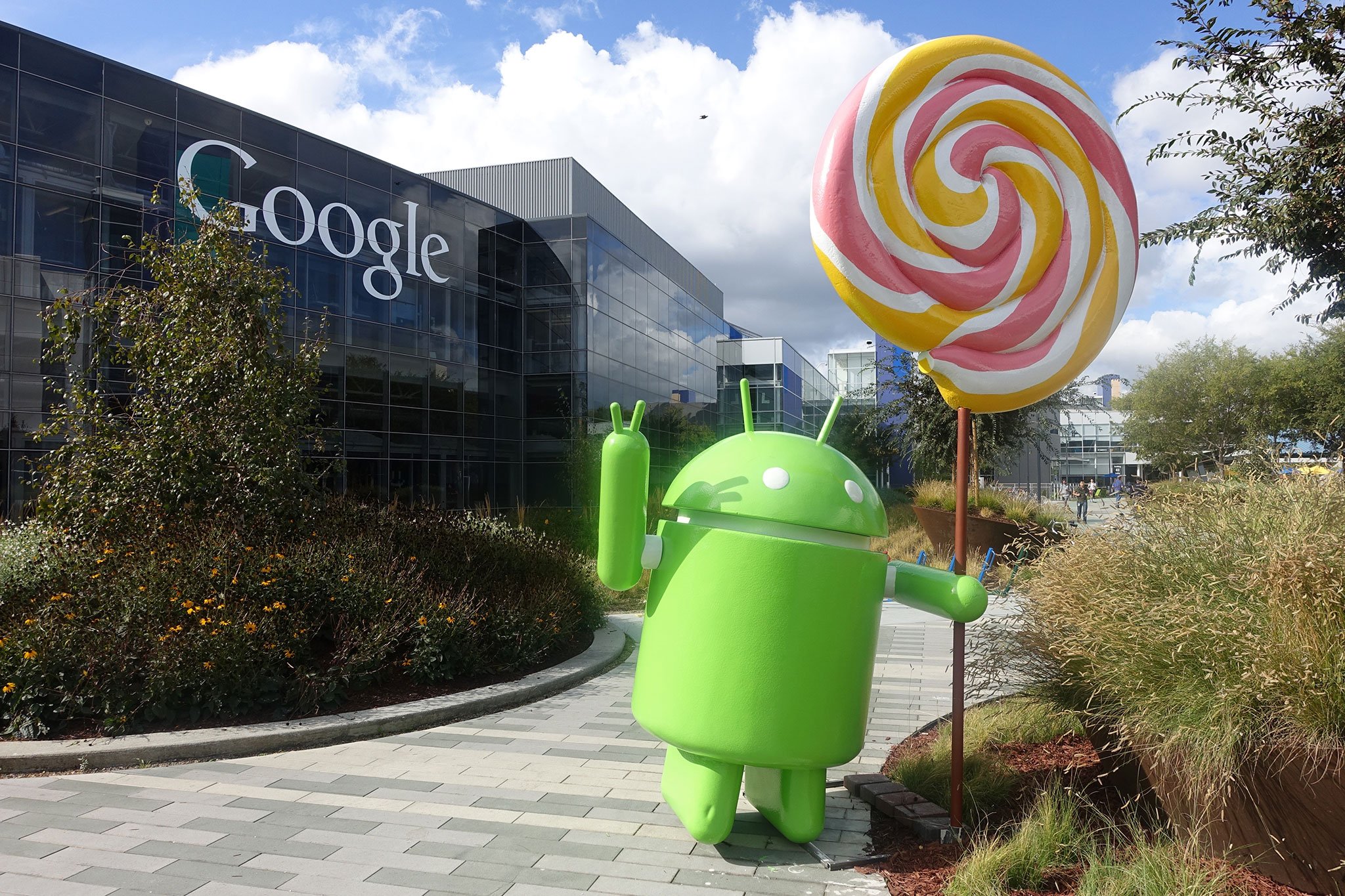
Autumn means it’s time for a new version of Android and new Nexus things for it to run on. In October of 2014, that meant Lollipop and three new pieces of nexus Hardware — the Nexus 6, the Nexus 9 and the Nexus Player.
The biggest change to Android in three years brought a new design language and a multitude of under-the-hood changes.
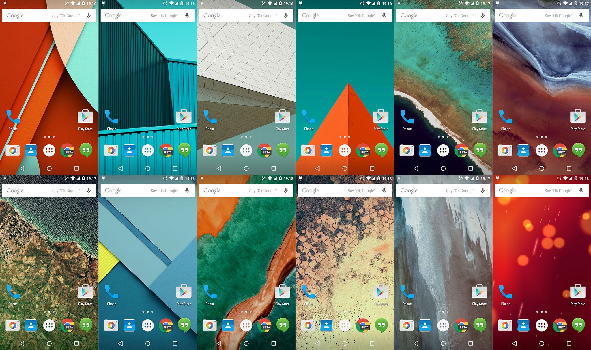
After several years of Holo design, Matias Duarte and his team of merry men unleashed Material Design upon us with Android 5.0 Lollipop. The changes were visually different — brighter colors, thinner fonts and a meticulous design that was built on the idea of layers of paper met with mixed response from the Android faithful, but most of the industry praised the coherent and beautiful design.
Material Design, and many of the thousands of new APIs were opened up to Android developers early, through the “Android L” (as it was then called) developer preview. For the first time in years, devs could get the future release of Android up and running on Nexus 5 and Nexus 7 devices months ahead of the final code drop.

There was a lot to like with Lollipop outside of the design as well. The new Tap and Go setup process made it simpler to move from one Android to another, Guest Mode and pinned apps for those times you need to let someone borrow your phone and Overview, the new multitasking view made for a better way to switch between apps and keep track of what might be running. Of course, a little Motorola DNA was there, namely the ability to say “OK Google” while your phone was in standby, and the new Ambient Display dropped a little bit of information on your screen while the display was “off” and idle. Good things all around, even if you weren’t a fan of Material Design.
In the early days of Lollipop, there were bugs. Lots of bugs.
Of course, plenty of bugs came along with Lollipop, too. Those were sorted reasonably quickly with updates, which of course were very slow to make it out to other devices that didn’t say Nexus on the back. Early versions of Lollipop on some models, for example the Moto X or the Galaxy Note 4, were not something anyone should be proud of. Android 5.1.1 sorted most of the issues, and Lollipop turned out to be a worthy update for productivity, stability and safety.
On the hardware side, Google also released three distinctive devices to showcase what was new, and to show what could be done.
The Motorola-built Nexus 6 was a 6-inch beast that polarized almost everyone. Beyond the size — the Nexus 6 was undoubtedly huge — the price of Google’s 2014 handset took many by surprise. Instead of keeping the trend of making well-built budget handsets, the Nexus 6 was priced just like any other high-end model from any other manufacturer. Motorola’s exceptional build quality and Google’s new OS wasn’t enough to get most people to pay $500 (or more) for an unlocked phone, and this certainly drew some colorful comments across the Internet. With all said and done (and now that you can get a Nexus 6 for a lot less of your cash) the Nexus 6 was one of 2014’s best phones — if you could get your hands around the big heavy frame.
64-bit Android was in for a rocky start on the temperamental Nexus 9 tablet.
Since it was also time for a new tablet, Google, HTC and NVIDIA got together and brought us the Nexus 9. The Nexus 9 brought two big changes to the world of Android tablets — 64-bit hardware and a 4:3 aspect ratio display. On the software side the Nexus 9 struggled with the same Lollipop issues the Nexus 6 did, and early units had some production quality issues to go along with them. It too had quite the expensive price tag, and reception was tepid at first. Eventually, issues like “bouncy” backs, memory leaks and high prices were sorted out and the Nexus 9 makes for a fine tablet for any Android enthusiast. Your videos will still be letterboxed because of the aspect ratio, but the 64-bit NVIDIA TK1 and Kepler GPU certainly makes up for it.

Lollipop also spawned a bit of an offshoot for the living room with Android TV. Android Lollipop at the core, views and features were specialized for a “10-foot interface” that supplanted the now-dead Google TV. For developers to test out applications designed for this 10-foot interface, reference hardware was required — hello Nexus Player. A small, flat black puck that had simple connection options — HDMI, power and USB — and underpowered hardware, the Nexus Player left many disappointed. The idea was to plug the Player into your TV, sign in with your Google account, and enjoy plenty of games and entertainment.
Unfortunately, the Intel Atom processor inside the Player didn’t have the power to make any of this enjoyable, and the 8GB of storage meant you couldn’t install very much of it in the first place. The Nexus Player — especially with Intel hardware inside — makes perfect sense for a developer reference device. But consumers weren’t happy, and we still can’t recommend the Nexus Player as anything except a fancy (and more expensive) Chromecast replacement.
Material Design
Fun fact: An operating system doesn’t have to have a graphical user interface. This is something the Linux faithful — the open-source OS on which Android is built — know full well, having run “headless” distros from the beginning of time. That doesn’t really work for a smartphone OS, of course. So, Android has a GUI.
But Android hasn’t always had what we’d consider to be a good user interface. Oh, it was plenty functional and became more refined over the years. But it wasn’t until 2014 and the “Lollipop” release that the Android user experience really had a solid foundation — and a foundation on which developers could build.
“We wanted to take a radical new approach to design,” Sundar Pichai — who in 2014 was head of Android, Chrome and Apps for Google — said in opening that year’s Google I/O developer conference. “User experiences are evolving rapidly, and we wanted to rethink the user design experience in Android to have a fresh, bold and new look.”
And this being Google we’re talking about, the new direction wasn’t limited to just smartphones and tablets and the like.
“User experiences are evolving rapidly, and we wanted to rethink the user design experience in Android to have a fresh, bold and new look.”

Enter Material Design, and Matias Duarte.
Duarte once was VP of Human Interface and User Experience at the now-defunct Palm, responsible for the team that made the beloved UI in webOS. He left for Google in mid-2010. A couple years into his new gig he was quoted as saying he was “a third of the way to where I want to be” with Android. We might not have really understood it at the time, but big things were in the works. And at the I/O conference in 2014, Duarte & Co. unleashed Material Design upon us all.
Duarte took to the stage. And in just a handful of sentences he explained Material Design in a way that was as simple as the design language itself is to those who live and breath colors and textures.
“Design is essential in today’s world. It defines your experiences, and your emotions. So we challenged ourselves to create a design that was not just for Android phones and tablets. We worked together — Android, Chrome and across all of Google — to craft one consistent vision for mobile, desktop and beyond.
“We wanted a design that was clear and simple and that people would intuitively understand. So we imagined what if pixels didn’t just have color, but also depth. What if there was an intelligent material that was as simple as paper but could transform and change shape and respond to touch?
“And this led us to a way of thinking that we call Material Design.”
Truly, it’s that simple. Picture, if you will, construction paper used by school-age children. (Only in more sophisticated, flat colors.) Backgrounds. Buttons. Lists. Actions. All interacting alongside and on top of one another, with smooth, elegant transitions.
That, in a nutshell, is Material Design. And it’s not just for operating system user interfaces and application design. You see it in Google’s web properties. And Google’s made it easy for just about anyone to use it, with color palettes and design libraries and guidelines — everything that’s needed to grow beyond the formless generations many of us grew up with and into the future of user experience.
Material Design in pictures and video
Material Design was an enormous change for Android, and design for the whole of Google — a new design language for the way we’ll use computers, phones and the web from the present into the future. For an overview how Google used layers, colors an animations to change the face of Android, check out our photo and video essay on Material Design.
More: Material Design photos and videos
ARC Welder: The beginning of Android apps on Chrome
Android isn’t the only platform in Google’s arsenal to grow at a breakneck pace over the last couple of years, and with that there’s always some talk of crossover between Android and Chrome. As Chrome becomes more and more like a standalone operating system no matter where it is installed, access to the Google Play Store’s enormous library of content sounds like the framework for a perfect tablet experience.

ARC welder is a first step, but Google’s made no promises on a ‘hybrid’ Chrome + Android experience just yet.
While Google hasn’t made any promises toward that hybrid experience just yet, the ARC Welder program makes it possible for Android developers to optimize and test their apps for use in desktop Chrome. To help users understand what this experience is going to look like eventually, a handful of apps are now available to use on Chrome OS as standalone apps that run in their own windows and behave close enough to native apps that the imagination fills in the gaps and lets everyone prepare for the future.
The big question here is what happens next? Will the Google Play Store become folded into the Chrome Web Store at some point? Perhaps more important, will we see Google work with their hardware partners to create a Microsoft Surface-like experience for Chrome and Android together on a single device? ARC Welder is clearly an example of how Google thinks this should work, and folding these two experiences together will undoubtedly produce answers to these questions.
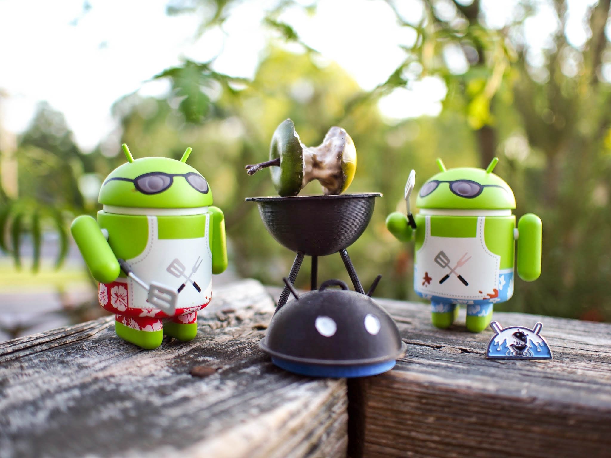
Meat and Greet: The Big Android BBQ
It’s no secret that there’s a pretty big community of Android developers and enthusiasts out there. And there’s no shortage of long-time Android users who have discovered they are physically near each other and plan some kind of get together to share some knowledge and have a good time. But the folks at IDEAA are now responsible for events all around the world to make this a lot easier.
It started with the Big Android BBQ, a massive three-day event in Texas that combines a social event with a developer conference. This event has spawned several single day “Meat and Greet” events that start as developer sessions and wind down to evening social events. This team has even started European events, and continues to be the largest series of social events with a focus on bringing developers and non-developers together to share knowledge and have a good time.
MORE: Relive this year’s BABBQ keynote
NEXT: Android’s Third Age
In the next and final (for now) installment of our Android History series, we’ll examine Android’s third age. As smartphone hardware starts to plateau, we’ll see how important new mid-range devices stole the show, and how Android cameras at the high end proved the potential of mobile photography. And in a transformative year for Google, we’ll look at the company’s journey towards being a mobile operator with Project Fi, as well as its re-organization under the “Alphabet” conglomerate and new Google CEO Sundar Pichai.
READ PART 8: Android’s Third Age
Credits
Words: Phil Nickinson, Alex Dobie, Jerry Hildenbrand, Andrew Martonik and Russell Holly
Design: Derek Kessler and Jose Negron
Jim Wicks Interview: Derek Kessler and Alex Dobie
Series Editor: Alex Dobie